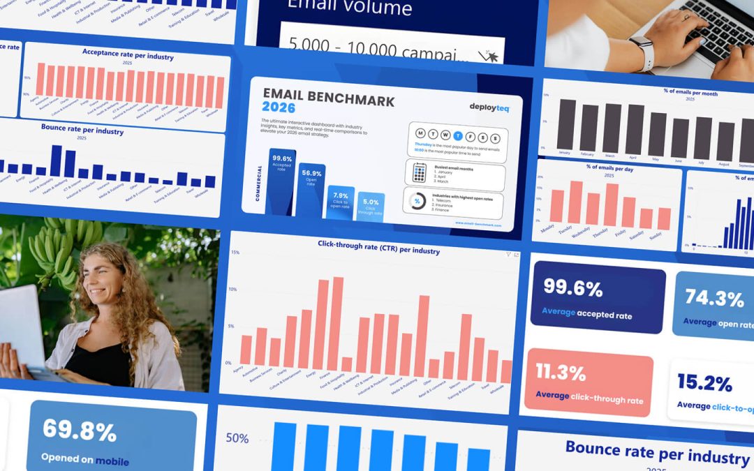
Your email looks perfect on desktop, but when customers open it on their phones, everything falls apart. Text becomes unreadable, buttons disappear, and your carefully crafted message transforms into a frustrating mess. With over 60% of emails opened on mobile devices, these design mistakes aren’t just annoying—they’re costing you conversions.
Responsive email design for mobile isn’t about shrinking desktop layouts to fit smaller screens. It requires a completely different approach that prioritizes user experience, readability, and seamless interaction across all mobile email dimensions. When done wrong, even the most compelling offers and brilliant copy won’t save your campaign from poor performance and conversion losses.
Why mobile email design makes or breaks conversions
Mobile email usage has fundamentally shifted how customers interact with brands. The majority of your subscribers now encounter your messages during quick moments—while commuting, queuing, or multitasking. This behavior demands emails that work flawlessly on small screens and deliver immediate value through proper mobile email optimization and responsive design standards.
Poor mobile experiences create friction that kills conversions. When subscribers struggle to read your content or can’t easily tap your call-to-action buttons, they simply delete your email and move on. This isn’t just about losing a single conversion—it damages your sender reputation and reduces future deliverability.
Modern email marketing platforms provide the tools to create responsive designs, but many marketers still rely on outdated templates that prioritize desktop viewing. The result? Campaigns that perform brilliantly on computers but fail spectacularly where most people actually read them.
1: Using fixed-width layouts that break on mobile
Fixed-width email templates are the enemy of mobile conversions and responsive email design best practices. These rigid designs assume everyone views emails on large screens, creating layouts that become completely unusable when squeezed onto mobile devices. Text gets cut off, images overflow, and your carefully planned design becomes a horizontal scrolling nightmare that violates modern email template size for mobile standards.
The problem goes deeper than aesthetics. When subscribers need to pinch, zoom, and scroll horizontally to read your content, they’re experiencing cognitive overload. Their brains are working harder to process your message, which reduces comprehension and kills the likelihood of taking action. Responsive design isn’t optional—it’s essential for maintaining engagement.
Instead of fixed widths, embrace fluid layouts that adapt to any screen size. Use percentage-based widths, flexible images, and CSS media queries that adjust your design based on the viewing device. This responsive email design approach ensures your message remains clear and actionable regardless of how subscribers access it, following mobile email design best practices for 2026.
2: Creating tiny, unclickable call-to-action buttons
Your call-to-action button might look perfectly sized on desktop, but if it’s smaller than a fingertip on mobile, it’s worthless. Apple’s Human Interface Guidelines recommend minimum touch targets of 44 pixels, while Google suggests 48 pixels for optimal mobile email dimensions. Anything smaller creates frustration and abandoned conversions that hurt your campaign performance.
Small buttons don’t just reduce clicks—they create negative user experiences that damage brand perception. When subscribers repeatedly miss your CTA because it’s too tiny, they associate your brand with poor usability. This psychological friction extends beyond the immediate campaign, affecting future engagement rates.
Mobile-friendly CTA design requires generous button sizes, adequate spacing between clickable elements, and contrasting colors that stand out on small screens. Consider using full-width buttons for primary actions, ensuring they’re impossible to miss even on the smallest devices.
3: Cramming too much content above the fold
Mobile screens offer precious little real estate, yet many emails try to cram entire desktop layouts into the top portion. This information overload overwhelms mobile users who are typically scanning quickly while distracted. The result is cognitive fatigue and immediate deletion.
Effective mobile email design follows a strict content hierarchy that aligns with responsive email design best practices. Your most important message—whether it’s an offer, announcement, or call-to-action—should dominate the initial screen. Secondary information can follow below, but the opening view must deliver immediate clarity about your email’s purpose and value.
Consider the mobile user’s mindset: they’re likely multitasking and have limited attention spans. Your email needs to communicate its core message within seconds, not paragraphs. Use white space strategically, limit text blocks, and ensure your primary CTA appears without scrolling.
4: What font sizes actually work on mobile screens?
Typography that looks elegant on desktop often becomes illegible on mobile devices following common email flow design mistakes. Text smaller than 14 pixels forces users to zoom in, creating friction that kills engagement. For optimal mobile readability and responsive email design performance, body text should be at least 16 pixels, with headings proportionally larger to meet modern design standards.
Font size affects more than readability—it influences user behavior and conversion rates. When text is comfortable to read, subscribers spend more time engaging with your content and are more likely to complete desired actions. Conversely, poor typography creates immediate barriers to comprehension and action.
Consider line spacing and font weight alongside size. Mobile email design requires increased line height (1.4 to 1.6 times the font size) and medium font weights that remain crisp on various screen densities. Test your responsive email design across different devices to ensure consistent readability and optimal mobile email performance.
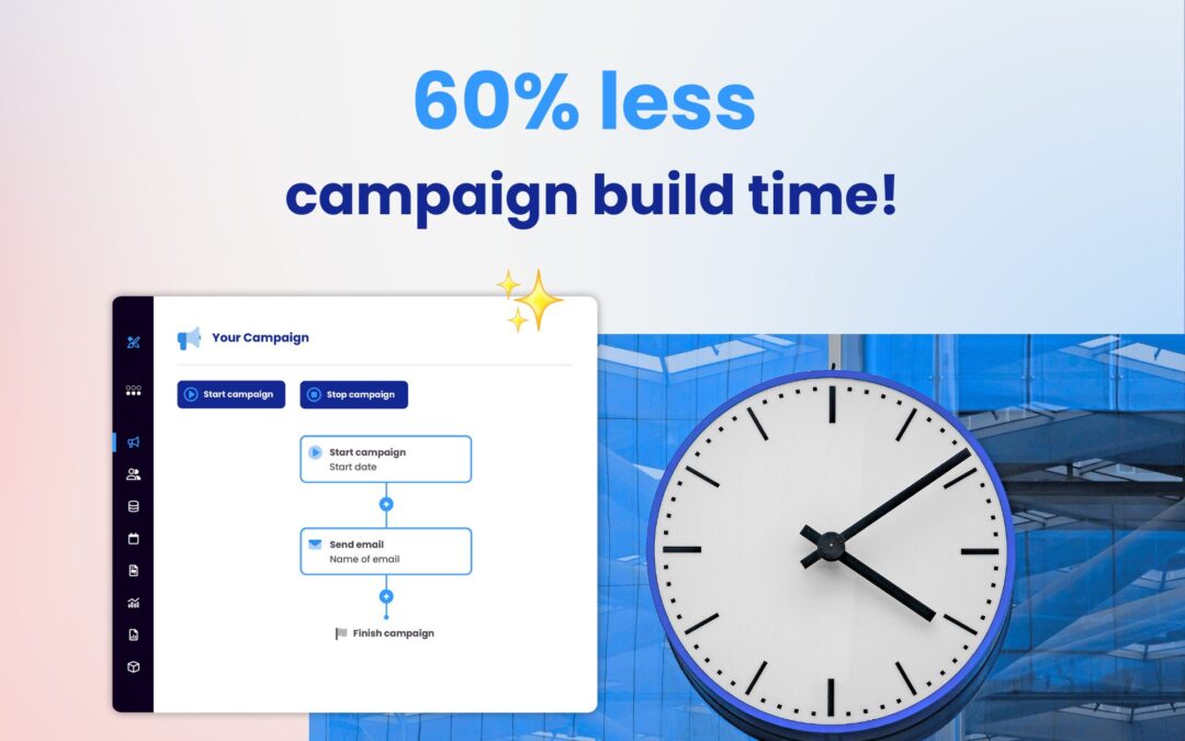
If you’re looking to optimize your mobile email performance, you can book a demo to explore advanced responsive design features and mobile-first templates.
Transform your mobile email strategy for better results
Mobile-first email design isn’t about adapting desktop layouts—it’s about reimagining how your messages work in a mobile-dominant world. Start with the smallest screen and build up, ensuring every element serves a clear purpose and enhances the user experience.
The most successful mobile email strategies prioritize clarity over complexity. Single-column layouts, generous white space, large touch targets, and readable typography create seamless experiences that drive conversions. These aren’t just design preferences—they’re conversion fundamentals for responsive email design best practices.
Begin by auditing your current email templates on various mobile devices. Identify the friction points that could be costing you conversions, then systematically address each issue. Remember, every improvement in mobile usability directly impacts your bottom line.
How we help with mobile email optimization and responsive design
Deployteq provides comprehensive solutions for creating mobile-first email campaigns that drive conversions across all devices. Our platform eliminates the common mobile email pitfalls that cost businesses revenue:
• Responsive email templates that automatically adapt to any screen size
• Mobile-optimized CTA buttons with proper sizing and spacing
• Typography settings designed for optimal mobile readability
• Real-time mobile preview tools for testing across devices
• Advanced analytics to track mobile vs desktop performance
• Drag-and-drop editor with mobile-first design principles
Ready to transform your mobile email performance and boost conversions? Contact us today to discover how we can revolutionize your mobile email strategy.
Related Articles
- How Do Marketing Automation Platforms Help Banks Personalise Customer Communications?
- How do I choose the right marketing automation platform?
- Can marketing automation replace email marketing tools?
- How do you build email flows that turn browsers into repeat buyers?
- What are the best email marketing practices for 2026?