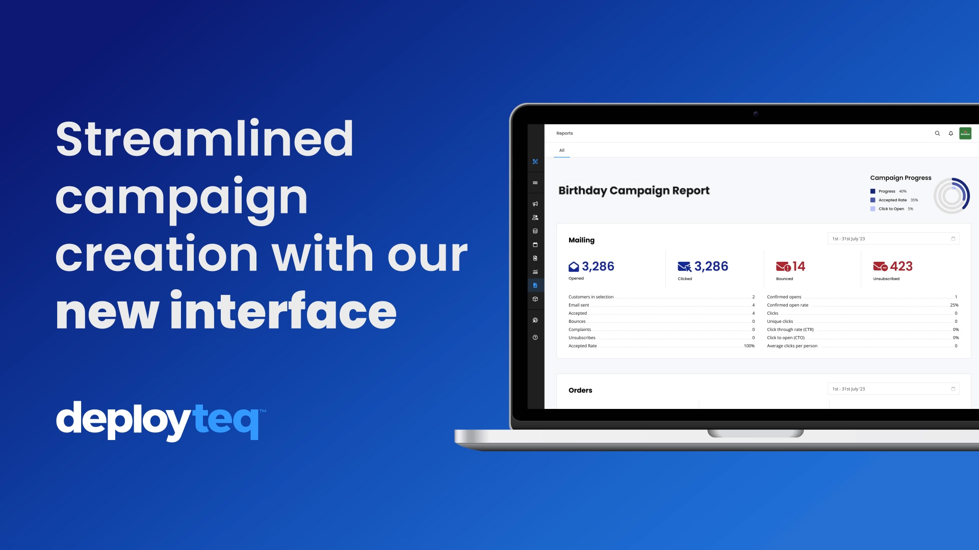
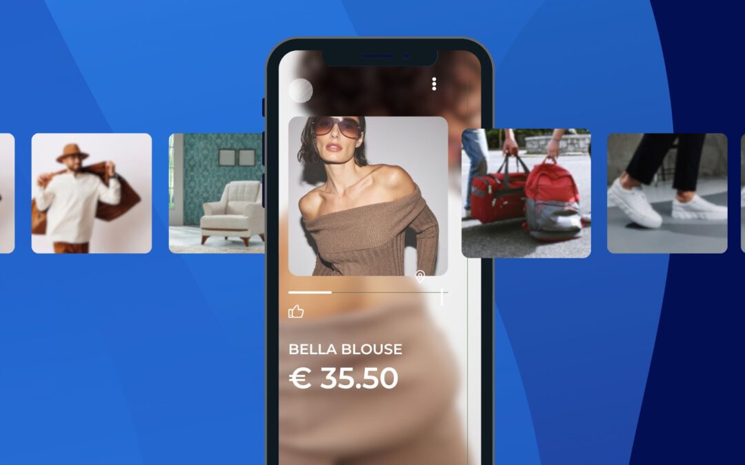
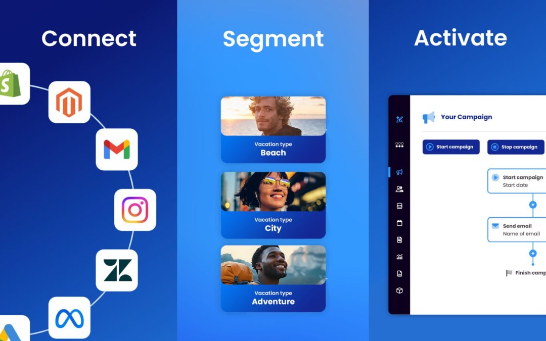
London, 19/09/2024 – Marketing automation platform Deployteq newly redesigned User Interface, crafted to empower businesses of all sizes with a powerful and intuitive platform.
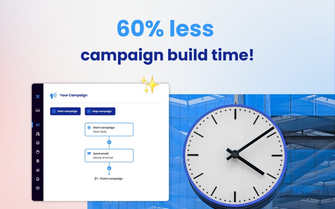
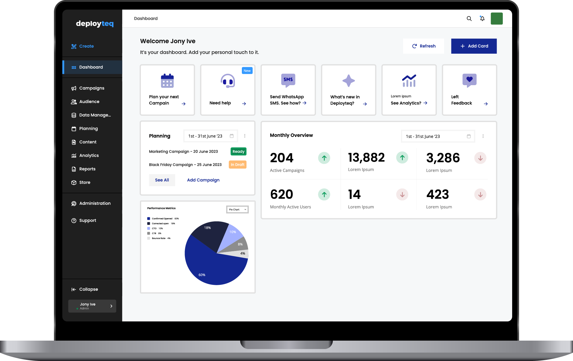
Designed with a user-centric approach, the streamlined interface reduces friction, enabling marketers to master the platform in record time and achieve more with every click. Setting up complex campaigns has never been easier with Deployteq’s new intuitive User Interface. The new UI brings a wide range of enhancements that address user feedback, market trends, and the latest in software design best practices. With enhanced features and a cleaner, more intuitive layout, Deployteq users can now navigate their data-driven customer journeys with unprecedented ease and precision.
Marketers lives are getting more technically complex and Deployteq’s mission, along with the relaunch of UI, is to simplify the complicated using a customer centric, efficient platform that boosts productivity.
“The business has grown immensely over the past few years, and we wanted our platform to match the maturity and evolution of the company,” said Sjuul van der Leeuw, CEO of Deployteq. “Too many platforms put user opinions at the back of the queue, which is where we wanted to stand out. Our goal is to have a modern take on a classic. With an upgraded icon set and clean, timeless colours, Deployteq will grow with its users and truly stand the test of time.”
With more messages being sent every year from the platform—a steady increase of over 4 billion year on year—Deployteq’s overhaul ensures that the user experience remains seamless and intuitive for its rapidly growing customer base.
The upgraded platform boasts a vibrant, modern colour palette, and upgraded reporting environment and a host of usability enhancements that reflect Deployteq’s commitment to delivering a user experience that’s not just efficient but downright enjoyable. Whether it’s optimising campaigns or diving deep into your data, the new design makes every task faster, smoother, and more effective.
Synergy with Storyteq
The redesign further strengthens the link between Deployteq and Storyteq, giving brands a more powerful toolkit to create and launch compelling content.
Onward and Upward
The new user interface is part of Deployteq’s wider growth push, with a pipeline full of exciting updates and innovations aimed at reshaping customer engagement to meet the evolving needs of marketers.
“We’re just getting warmed up,” teased van der Leeuw. “This redesign is the launchpad for an even bigger transformation. Our goal is to continuously push the boundaries, delivering a platform that not only keeps pace with the digital landscape but helps our users stay ahead of it.”
About Deployteq:
Deployteq is a marketing automation platform and part of ITG. It unifies customer data and allows marketers to easily create personalised customer journeys across multiple channels including email, SMS, mobile and social media. Deployteq is trusted by brands such as Wickes, Virgin Media, Marstons, Center Parcs and more.
About ITG
ITG were founded in 2009 with a mission to simplify the complicated, automate the tedious, and create the beautiful. As the leading halo content partner to businesses around the world, ITG eliminate marketing complexity and deliver engaging, tech-enabled, agile content that drives growth and reduces marketing costs. Clients include John Lewis Partnership (JLP), Heineken, PUMA, M&S, KFC, Jaguar Land Rover (JLR) and more. ITG employ over 1,500 people throughout their global offices and are headed up by CEO, Andrew Swinand.
