Travel agencies have experienced significant shifts over the past few years. From high street dominance to niche online offerings, Covid-19 lockdowns to booking surges.
To avoid the negative impact of these unpredictable highs and lows, in 2024 it has been more important than ever for travel agencies to effectively engage with their audience and secure them as long-term customers.
As a result, at Deployteq we have come across some seriously inspiring emails from travel agencies. And in this blog post, we highlight five of our favourites from brands big and small.
Read on to gain inspiration, learn from the best, and maybe be tempted to book a trip.
1. Welcome – The Adventure People
What better place to start our inspirational email post than with a welcome campaign?
After all, this is often the first communication aspiring travellers will receive from a travel agency, so it’s important to set the tone for a positive relationship.
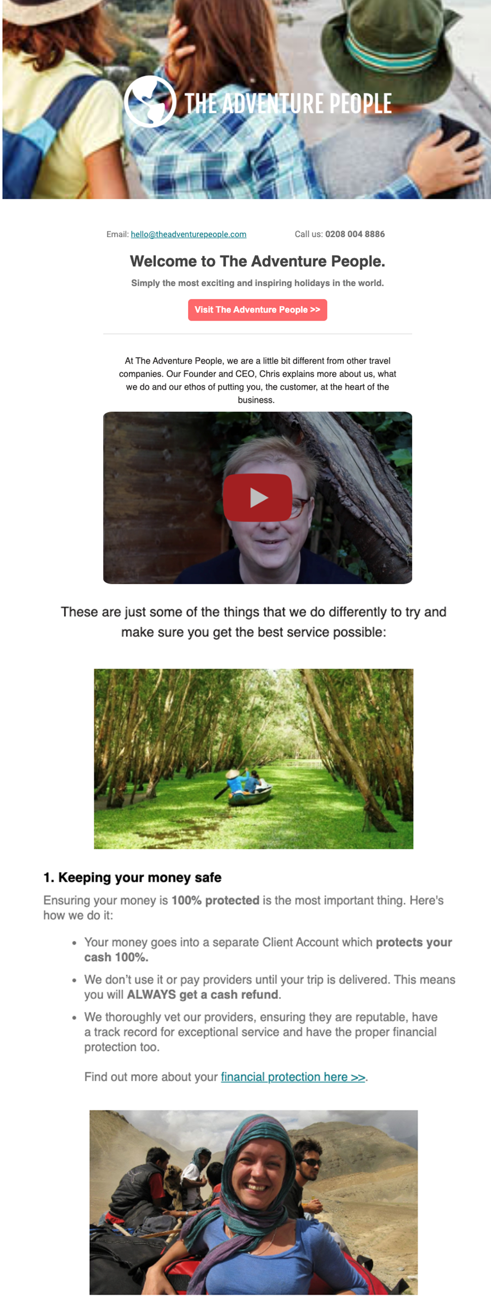
This welcome email from The Adventure People ticks all the best practice boxes, and then some.
Immediately, we love the variation of eye-catching imagery featuring inspiring landscapes and captures of real, relatable people enjoying their travels.
This is complemented by an introductory video from the brand’s CEO, which is perfect for familiarising travellers with the brand, adding a friendly face to the communication, and building a human connection.
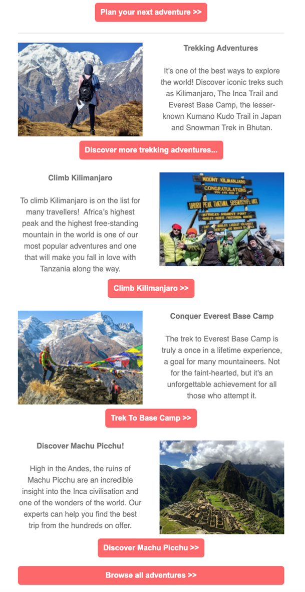
But The Adventure People don’t rely on visuals in their email, the content is also genuinely helpful. Including an overview of the benefits of booking with the brand, promotion of some of their most popular and exciting trips, and key contact details if recipients have any more questions.
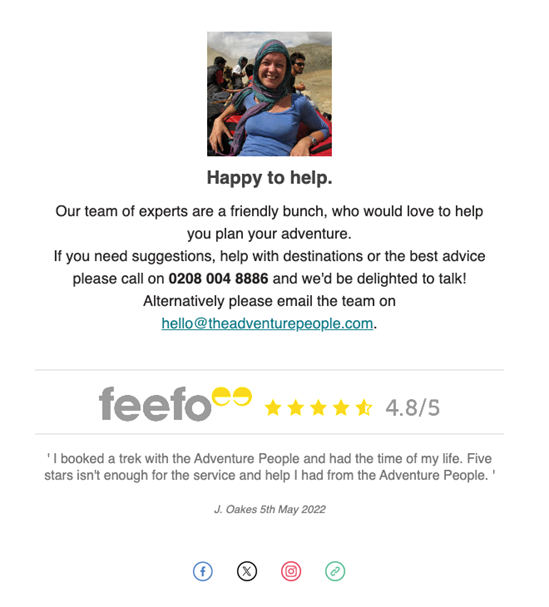
And if this isn’t enough to convince travellers to book with The Adventure People, they finish their email with their impressive Feefo score, to add extra reassurance from their happy customers.
Social proof – Journee
Talking about adding reassurance to email campaigns, social proof is another excellent way to build trust with your recipients, as well as spark a little wanderlust. In fact, 95% of consumers read online reviews before they purchase, and 58% report they would spend more with a brand that has good reviews.
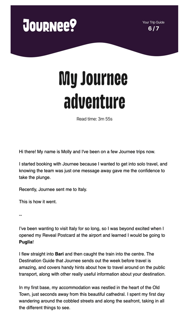
Instead of simply adding quotes or reviews from their happy travellers, Journee takes social proof one step further by offering an entire email communication written by a loyal customer.
In this email, Journee finds the sweet spot between engaging copy and visuals.
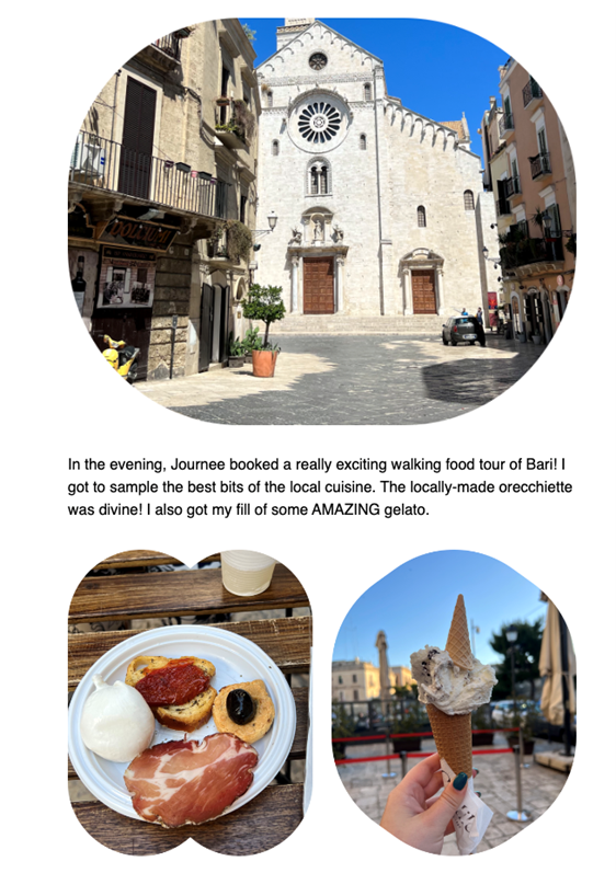
The copy not only feels personable and relatable but also provides itinerary suggestions from this traveller’s recent trip with Journee to Bari, which both sparks inspiration and offers helpful advice to potential travellers. There are benefits to booking with Journee subtly peppered throughout, encouraging recipients to make a booking without being too sales-y.
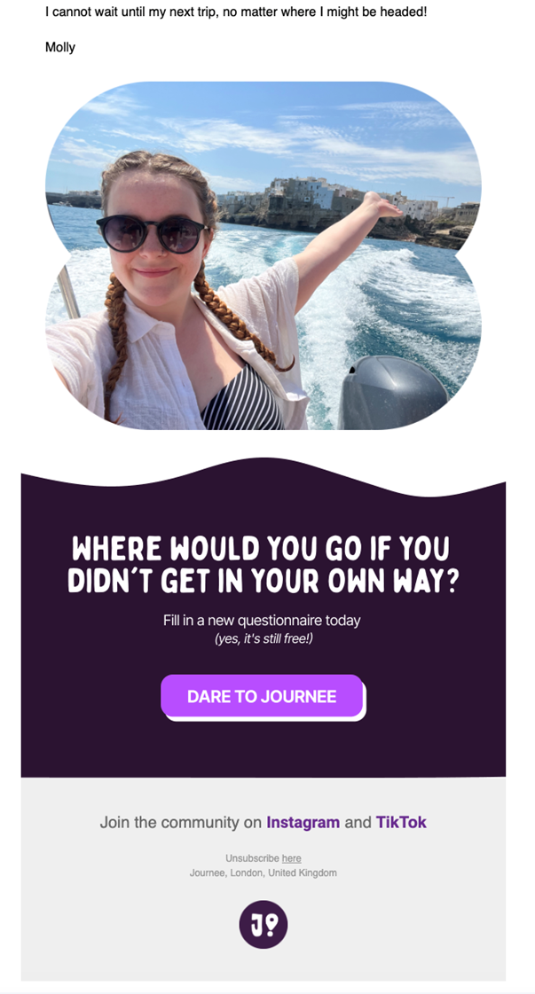
The images incorporated from the trip add an additional human element to the email, and visually show the recipient what their holiday with Journee could look like.
We also love the clever additions to this email, such as the estimated reading time which sets expectations from the start, and the questionnaire which provides the traveller with tailor-made trip suggestions, but also provides Journee with useful data and insights into their recipients.
Personalised destinations – Booking.com
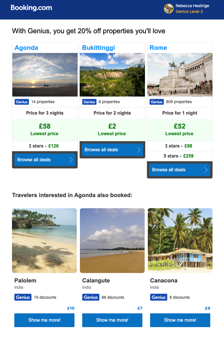
Booking.com always excel in their personalised, tailored email communications.
With the use of data collection and dynamic content, the brand identifies the browsing behaviour of their recipients and automates communications with destinations specifically tailored to their behaviour.
But that’s not all, their further use of dynamic content allows Booking.com to populate their emails with real-time information, such as the pricing for different properties in each area.
And if those trips don’t pique the recipient’s interest, the brand also suggests destinations that other travellers with similar browsing behaviour have explored and booked. Not only is this incredibly helpful for the traveller, but also increases the likelihood of them re-engaging with the site, and booking a destination that suits them.
Last but not least, Booking.com use these communications to reward their loyal ‘Genius’ travellers, offering them an exclusive 20% off discount on properties booked through the site.
Abandoned browse and booking – Airbnb
Unfortunately, the travel industry has one of the highest abandonment rates of all sectors, estimated to be as high as 87%.
This perhaps isn’t too surprising. Travel bookings are often expensive, require extensive research, and involves cross-referencing with annual leave, flights, and events.
To address this challenge, Airbnb keep their abandonment emails simple and image-focused, but highly effective. They begin with a large photo from the previously viewed accommodation, after all, if it’s caught the recipient’s eye before, it’s sure to happen again.
They utilise dynamic content to further personalise this reminder, incorporating the dates they have searched for, the price, and the current star rating for the property.
Their simple call to action is clear and prominent, whilst utilising Airbnb’s brand colours. And the copy ‘Get details’ is the perfect way to encourage travellers to further explore the property, without the pushiness of ‘Book now!’.
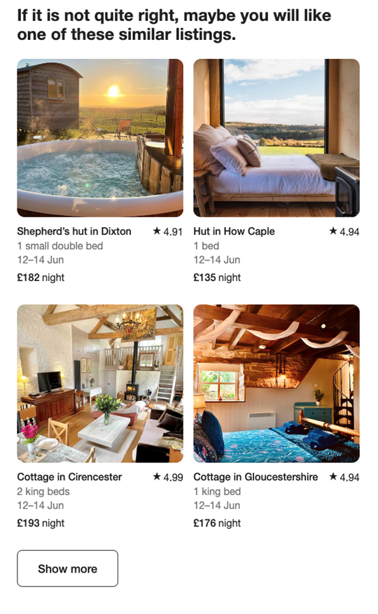
Of course, Airbnb know that sometimes a property isn’t quite right for the recipient. To maintain their interest, they also personalise the email with similar listings that may be of interest, again utilising dynamic content to incorporate similar dates available, associated costings, and up-to-date star ratings.
Re-engagement – Unyoked
When a recipient disengages with a brand, whether that means no longer opening emails or failing to make a booking, sometimes a different tactic is required.
Traditionally, travel agency Unyoked fill their emails with strong visuals, but with their re-engagement email, they decide to take a more stripped-back, personal approach.
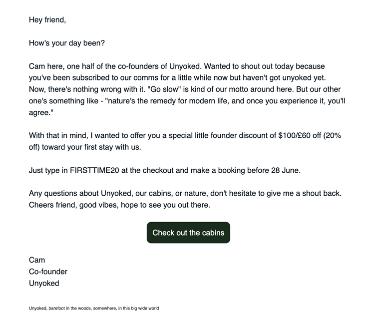
The email emulates a personal communication without the usual HTML template additions. And whilst Unyoked don’t seem to have first name data, using “Hey friend. How’s your day been?” still gives us a warm fuzzy feeling.
The copy makes it immediately clear that this email is from Cam, a co-founder of Unyoked, reinforcing the importance of the recipient’s engagement.
The messaging continues to be friendly, approachable, and on-brand, which is likely to appeal to their target audience.
And the email is topped off with a discount, exclusively from the co-founder, encouraging the recipient to make a booking with the brand.
We love the simplicity of this email. It’s short, sweet, and feels incredibly personal. Which is sometimes all that is needed to recapture the attention of a recipient.
Next steps
We hope you have felt inspired by just some of our favourite email campaigns from travel agencies.
From welcome campaigns crammed with useful information, to innovative use of data for impressively personalised destination suggestions, and not forgetting re-engagement campaigns that give us that warm fuzzy feeling.
These emails are examples of how travel agencies can successfully nurture customer relationships and drive engagement. With little need for additional resource, budget, and stress.
At Deployteq, we specialise in helping brands in the travel industry achieve all of the above with the use of our industry-leading marketing automation platform alongside the support and guidance of our travel experts.
If you’re feeling inspired, get in touch with us to start your journey.
